Rollins Logo Refresh
Rollins has been making changes to its curriculum in response to the shifting landscape in liberal arts education and to meet the expectations of the next generation of prospective students. With that in mind, the Rollins logo no longer felt reflective of the direction that the college is headed. The logo also had some technical issues that made it feel unprofessional and dated.
The principal role of a logo is to identify, and simplicity is its means… Its effectiveness depends on distinctiveness, visibility, adaptability, memorability, universality, and timelessness. – Paul Rand
Typeface choice: The current Rollins logo was built with Palatino regular, which was designed for use in running text, not standalone logos. Text typefaces are typically designed for legibility and should only be used as mixed-case (upper- and lower-case) in sentence form.
Typeface manipulation: The regular version of Palatino wasn’t designed as an all-caps typeface as it appears in the Rollins logo. Manipulating the letters of the typeface to design the current logo created issues that affected the quality and professionalism. To achieve the initial cap “R,” the “R” was enlarged, resulting in a heavier stroke (#2, #3) than the other letters. Visually, the heavier stroke interrupts the flow of the letters.
Typeface spacing: Using this text weight typeface creates odd spaces between letters (#1, #4). These gaps and spaces can be distracting to the viewer and can affect the readability of the logo at various sizes and add to its unprofessional appearance. Properly designed logos pay close attention to details that when done correctly, will go unnoticed. When these details are overlooked, most viewers will notice the problems it will create.
Refreshed Typeface choice
Choosing a typeface is no arbitrary process. Several factors need to be considered when choosing the right typeface to represent the Rollins brand:
Legibility and readability
Size and shape of the letterforms (serif, shoulder, and terminal)
Spacing between letters and the x-height of the lowercase letters
The intended purpose of the typeface: Is it designed as a display typeface?
Does the typeface reflect the aesthetics expected by our audience?
The natural (without adjustment) space between “R” and “o” (#1)
and “r” and “o” (#2)
Given the parameters defined here, the typeface Chronicle is the best fit for the Rollins brand going forward. Chronicle was designed and built by the same type foundry that created Gotham, the sans-serif typeface that is currently part of the Rollins brand and will carry forward as the brand is refreshed. These two typefaces compliment each other well and are used appropriately together.
Refreshed Wordmark
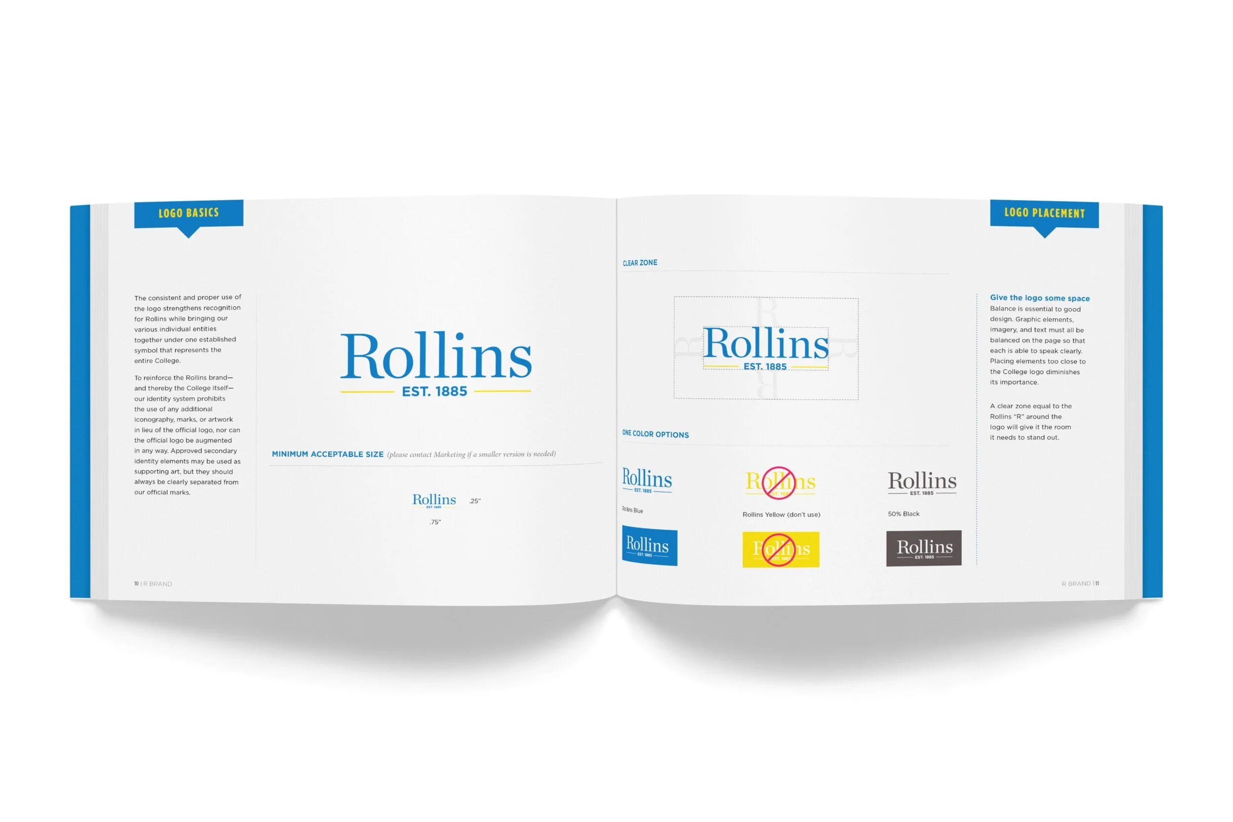
Visually, the spacing in the Rollins wordmark set in Chronicle is more even, which improves the logo’s legibility while the mixed-case use enhances readability. Chronicle maintains the feel of the original Rollins logo while allowing the Rollins brand to take on a more sophisticated and contemporary attitude.
Refreshed Logo
“Est. 1885” set in Gotham serves as a reference to our history and heritage.
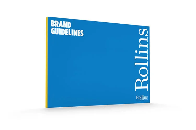
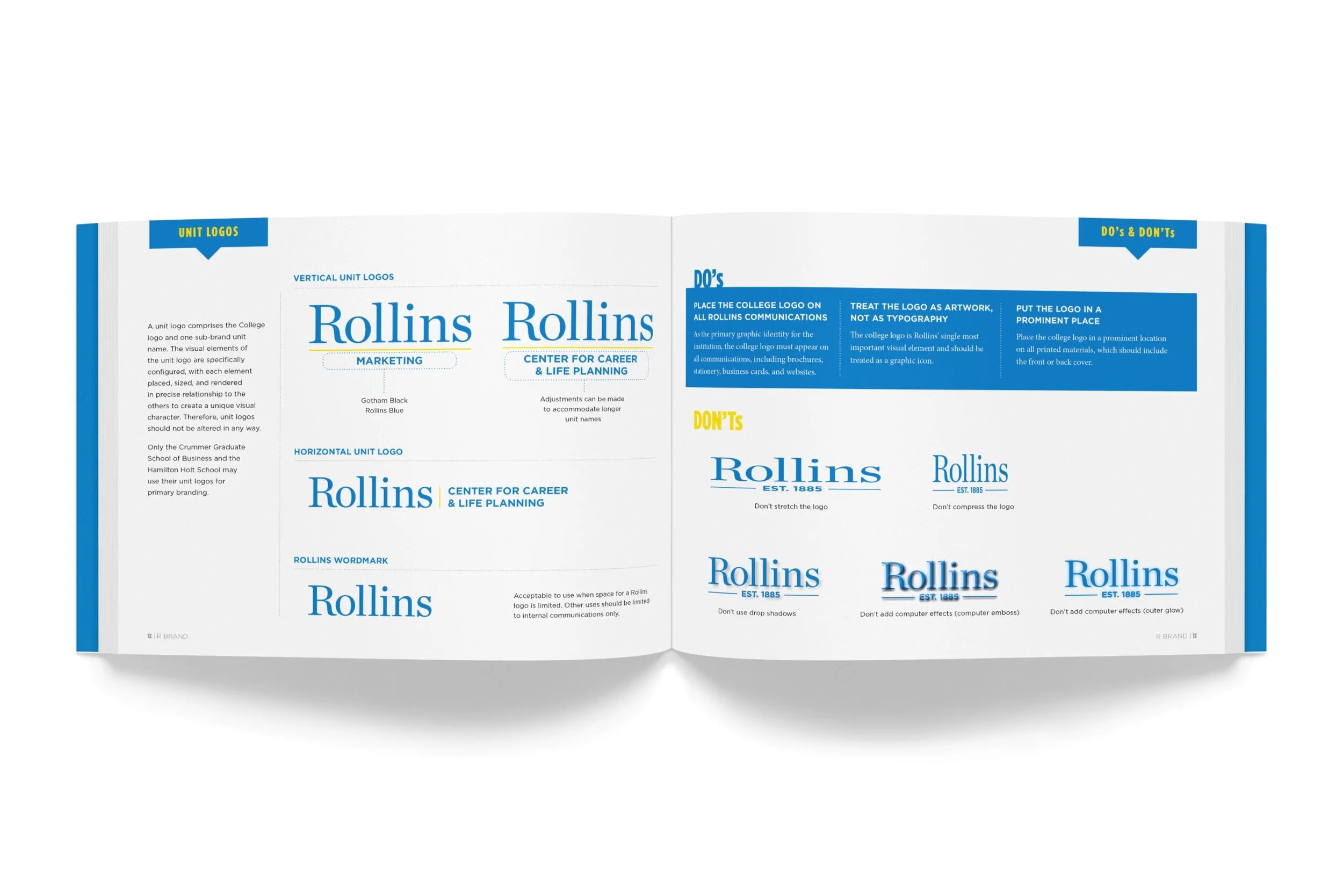
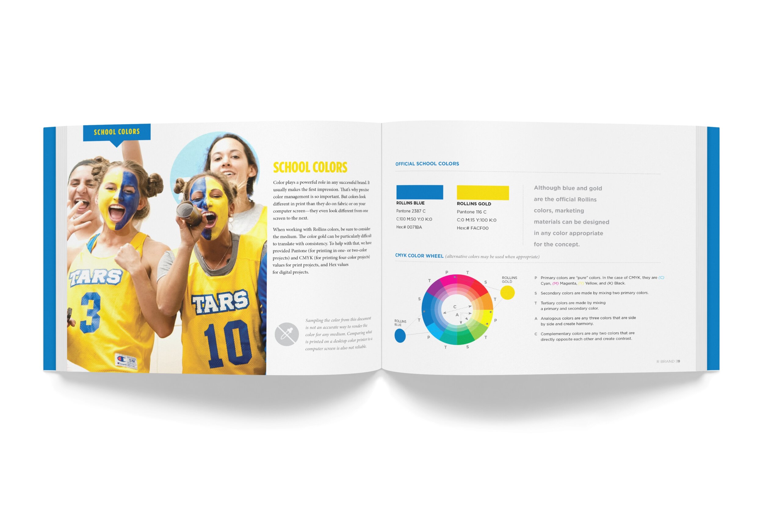
Rollins Brand Guidelines
Concept, design
Knowles Tower Icon Refresh
The tower icon is an easy visual representation of Rollins and the architecture on the campus. The existing icon was too flat and lacked detail.


